
The visible part of a spatial study is the model — the coefficients, the map of local effects, the story about where a relationship is strong. The larger, quieter part is everything that has to be true before a single regression runs: rows that are actually comparable, distances measured in real meters, and travel costs that follow the street network rather than a ruler laid across the map. This note sets out that pipeline generically — from raw points and boundaries to an analysis-ready layer — and then the modeling ladder that sits on top of it. The examples are deliberately textbook (“walking time to the nearest station”); the pipeline is what carries from one study to the next.
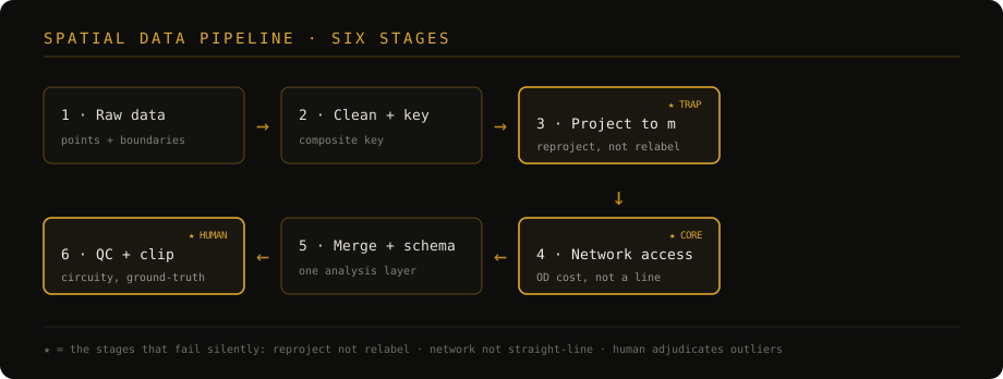
The ★ stages below are the ones most likely to fail silently, so they get the most attention.
Clean and key, before you join
The first join is where most silent data loss happens. Attribute tables arrive with trailing spaces, mixed full- and half-width characters, and inconsistent name spellings; a naive join on a raw name field drops the non-matching rows without complaint. So the first pass is text standardization — trim, normalize width and case — followed by a composite key that encodes everything that makes a row distinct.
A key built from a single name field is rarely enough. If observations repeat over time, the key has to carry the period too, for example year + area, so that the same place in two different years stays two rows instead of silently collapsing into one. The rule of thumb: build the key from every field that individuates an observation, and confirm the join count matches expectation before moving on.
Project to meters, and mind the trap
Latitude/longitude are angles, not distances. Any computation of length, area, or travel time on geographic coordinates is quietly wrong, and the error varies with location. So before any distance work, reproject every layer to a projected coordinate reference system — one whose units are meters and whose distortion is small over the study area.
The trap here is a pair of similarly named tools. One reprojects — it recomputes coordinates into the new system. The other only defines a projection — it rewrites the metadata label and leaves the coordinates untouched. Using the second where you meant the first produces data that looks correctly projected and is geometrically wrong everywhere downstream. Reproject; never relabel.
Accessibility on a network, not a straight line
“Distance to a station” has two very different meanings. The straight-line (“as the crow flies”) distance is cheap and almost always understates real access, because nobody travels through buildings and rivers. What a hedonic or accessibility model usually wants is network distance or time — the cost of actually walking or driving there — computed as an origin–destination cost matrix over a routable street layer.
Two cases recur:
- One assigned facility. When each location maps to a single designated facility, take the cost to that assigned pair directly.
- Choice among facilities. When there is no single designated facility, take the cost to the nearest one (the rank-1 row of the OD matrix) as a proxy for best available access.
Keep the straight-line distance too, though — not as the accessibility measure, but as the denominator for the quality check that comes next.
Quality-control the distances
Routing graphs break. A missing or mis-snapped segment forces the algorithm on an absurd detour, and a handful of impossible travel times can distort an estimate. A circuity index surfaces them — the ratio of the network cost to the cost a straight line would imply at a nominal travel speed:
circuity = network_time / (straight_line_distance / travel_speed)A value near 1 is a direct path; a large value is a detour. Screen the upper tail with an interquartile fence rather than a hand-picked cutoff:
upper fence = Q3 + 1.5 × (Q3 − Q1)But an outlier is not automatically an error, and this is the step that cannot be automated away. A detour forced by a river or a rail corridor is real geography — a genuine travel penalty — and should stay. A detour caused by a broken network link is noise and should go. The index proposes candidates; a person adjudicates them against the map. Deleting on the statistic alone throws away exactly the real spatial friction the study is trying to measure.
Assemble and clip
With distances trusted, standardize the schema — one agreed name and type per field — and merge any parallel sub-pipelines into a single analysis layer. Finally, clip the layer and its background to the study boundary, so that maps end cleanly at the same edge instead of trailing off into surrounding territory. The output of this whole stage is one table: comparable rows, metric distances, network-based access, documented quality control. Only now does modeling begin.
The modeling ladder: OLS → spatial → local

The layer supports a three-step progression, each step earned by a diagnostic rather than assumed.
- OLS as a baseline — then diagnose. Fit ordinary least squares for the global average effect, then test the residuals with Moran’s I, which asks whether they cluster on the map. If neighboring residuals look alike, OLS has left spatial structure unmodeled and its standard errors cannot be trusted.
- A global spatial model absorbs dependence. When dependence is present, a spatial-error or spatial-lag model (the spatial Durbin nests both) folds the neighbor structure into the specification. This fixes the dependence — but still assumes a single relationship that holds everywhere.
- A local model when the relationship itself varies. When the effect is not constant across space — spatial heterogeneity, not merely dependence — geographically weighted regression (GWR) estimates one coefficient per location, a surface you can map rather than a single number you have to defend everywhere.
Why the local view is worth the trouble
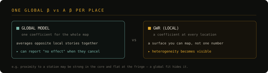
A single global coefficient can be the average of opposite local stories, and will happily report “no effect” where a strong positive effect in one region cancels a strong negative one in another. As a textbook illustration: proximity to a station might command a large premium in a dense core and almost none at the urban fringe. A global fit reports one number and hides the split; a local fit shows the premium fading with distance from the center. The entire pipeline exists to make that kind of variation visible reliably — so that a local coefficient reflects the world, not a broken network edge or an unprojected distance.
The pipeline is reusable; the coefficients and the map are what each specific study contributes. Keep the two straight — the method travels from project to project, the findings stay with the project that earned them.